
Wednesday, 29 February 2012
Good morning!!
I am trying to find out if I can save the google pie chart that can be created in the google fusion tables...
So far I've found that we can link the pie chart..
Here I have and example.. https://www.google.com/fusiontables/
I am not sure if that works to people who are not allowed to view the data, since I think my data set is private to only Dominic and myself.
 Print screen option works ok with saving the graphs, but that way you lose the interactiveness in the data.
Using Taxotoy
Taxatoy is an application that graphs the number of new species discovered every year, from 1750 to 2000.
I thought I would compare the data I find from this site for our phyloinformatics project..
 It seems that this site might need an update, since our timeline for the years 1992-2000 differs a bit in the results we are viewing in the site.
 Graphs to be compared in our analysis paper...
 Results from Google Ngram Viewer. Showing the number of scientific papers and books referring to new mammal species during the years 1992-2008. The results are those expected.


Tuesday, 28 February 2012
Global distribution of new mammals described since 1992

Fusion Pie Chart
Working on our phyloinformatics project... My friend Dominic and I, we managed to merge all the New mammal species we pasted in excel and finally upload them in Google Documents, even though we had some difficulties, we did it..and know we need to process the data.. It seems as it's not as easy as we thought..
 Trying to make a pie chart of the locality found in each specie, this is the pie chart that we got...therefore, we needed to find a way to modify it in order to recognize each "I" and "C" and group them and number them into one category each... Google is our friend...
 I found that in order to make a pie chart, I should aggregate the data first.
This counts the category in each locality and produces the following pie chart, by selecting Visualize -> Pie chart:
I found that in order to make a pie chart, I should aggregate the data first.
This counts the category in each locality and produces the following pie chart, by selecting Visualize -> Pie chart:
 Where we can see that most new mammal species were found in a continental area (70.4%). We would suspect that, most species in an insular area would be known much earlier in time, however we have a 29% of them that were found in the last decade. Finally, only two new mammal species were found in the marine environment (0.6%).
Source - analysis of data table in the following paper:
DeeAnn M. Reeder, Kristofer M. Helgen and Don E. Wilson "Global Trends and Biases in New Mammal Species Discoveries" - Texas, USA, 2007.
...After completing the pie charts...I figured out how easy it was to make a time line.. and bar graphs... So I started "playing" with visualizations:
Where we can see that most new mammal species were found in a continental area (70.4%). We would suspect that, most species in an insular area would be known much earlier in time, however we have a 29% of them that were found in the last decade. Finally, only two new mammal species were found in the marine environment (0.6%).
Source - analysis of data table in the following paper:
DeeAnn M. Reeder, Kristofer M. Helgen and Don E. Wilson "Global Trends and Biases in New Mammal Species Discoveries" - Texas, USA, 2007.
...After completing the pie charts...I figured out how easy it was to make a time line.. and bar graphs... So I started "playing" with visualizations:


Saturday, 25 February 2012
BioGeomancer...and other sources of Georeferencing
Over the past 250 years, biologists have gone into the field to collect specimens and associated environmental information documenting the range of life. The results of these explorations are an irreplaceable archive of Earth's biological diversity that plays a fundamental role in generating new knowledge and guiding conservation decisions. Yet, roughly one billion specimen records, and even more species observation records, remain practically unusable in their current form.
Georeferenced biocollection data is in high demand. Mapping species occurrence data is fundamental to describing and analyzing biotic distributions. This information is also critical for conservation planning, reserving selection, monitoring, and the examination of the potential effects of climate change on biodiversity. Increasing the availability of georeferenced species distribution data will vastly increase our ability to understand patterns of biodiversity and to make balanced conservation-related decisions. Most data in these analyses come from natural history collections, which provide unique and irreplaceable information, especially for areas that have undergone habitat change due to clearing for agriculture or urbanization. (source)
BioGeomancer is a tool that provides a Geo-referencing service for collectors, curators and users of natural history specimens...I guess that's where GIBIF started from.. It seems like the Workbench was completed in 2007. It was using three existing applications, BioGeomancer Classic, GEOLocate, and DIVA-GIS. By browsing in this site I have a collection of many Geo referencing sites other than GIBIF:
One that will probably seem useful to me as a marine scientist is the OBIS:Ocean Biogeographical Information System.
An other one is the MaNIS:Mammal Network Information System, which we can use in our New Mammals phyloinformatics project..
and other sites such as ORNIS, or REMIB.
Friday, 24 February 2012
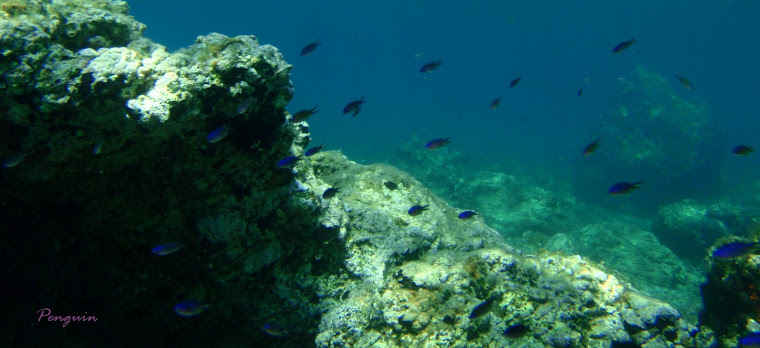
Seeing the Great Barrier Reef from our couch...
Millions of people will be able to dive on the Great Barrier Reef thanks to a ground-breaking expedition.
The Catlin Seaview Survey will upload on Google Earth about 50,000 panoramic images of the reef. When those images are merged, it will feel to people like they are virtually diving in the Reef! (source: www.heraldsun.com.au - February 24, 2012 10:04AM)
ahh... so amazing... Can I work here?? :-)
Thursday, 23 February 2012
Bio-hacker..
Today I had a 6 hour seminar on office Access in the Library of Glasgow Uni.. and I was wondering all day... Why? Why is there NO free software for pdf conversion to excel or access??? ..After a small google search and some downloads, I found this program called "Able2Extract", which was not too bad for a simple conversion.. but as my friend Dominic described in his blog, our data was still not merged into the cells, so we either had to do it manually, since excel can't keep all text while merging.. or..try and find another way to do it... So I thought I'd experiment a little... first I tried to hack :) the trial version (sshhhhh) Just in case the full version had more options... no success...
 I tried to figure out what to do with defining the rows and the columns in each page.. But it had to be done manually, and still needed cleaning in the end ..
 After browsing to different sites and some free downloading of trial version programs, I got the most clear result by using Nitro PDF Professional online, which e-mailed me the file with the converted PDF into XLS format.
 The data definitely needs more work.. so manual copy - paste can't be avoided...
Why am I doing all this?? - Forgot to mention earlier about our Phyloinformatics project decision. We agreed with my friend Dom what we will both work on the New Mammal data provided by the paper published by D.M. Reeder, K.M. Helgen & D.E. Wilson (2007) "Global Trends and Biases in New Mammal Species Discoveries".
We will try and apply as much as possible from everything we learned in the phyloinformatics course. We talked about doing all kind of analysis. For now we will clear up the data in the excel and create a fusion table and work with that, while doing some background reading on methods for defining new species.
Dominic also uploaded his cool ftw blog http://natureftw.blogspot.com/ so we'll both be reporting our everyday phyloinformatics concerns...
Goodnight world of blog.. tomorrow, hopefully more posts of our project evolution..
The data definitely needs more work.. so manual copy - paste can't be avoided...
Why am I doing all this?? - Forgot to mention earlier about our Phyloinformatics project decision. We agreed with my friend Dom what we will both work on the New Mammal data provided by the paper published by D.M. Reeder, K.M. Helgen & D.E. Wilson (2007) "Global Trends and Biases in New Mammal Species Discoveries".
We will try and apply as much as possible from everything we learned in the phyloinformatics course. We talked about doing all kind of analysis. For now we will clear up the data in the excel and create a fusion table and work with that, while doing some background reading on methods for defining new species.
Dominic also uploaded his cool ftw blog http://natureftw.blogspot.com/ so we'll both be reporting our everyday phyloinformatics concerns...
Goodnight world of blog.. tomorrow, hopefully more posts of our project evolution..


Subscribe to:
Posts (Atom)